Brand Strategy – Logo & Visual System Design – Marketing collaterals – UI & Web Design
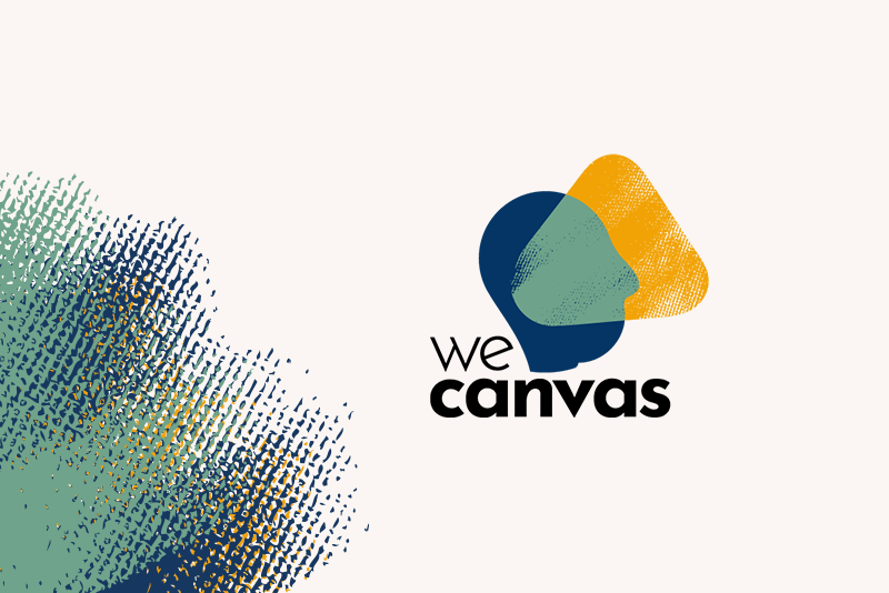
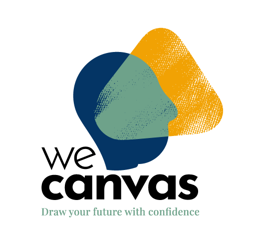
WeCanvas
2021
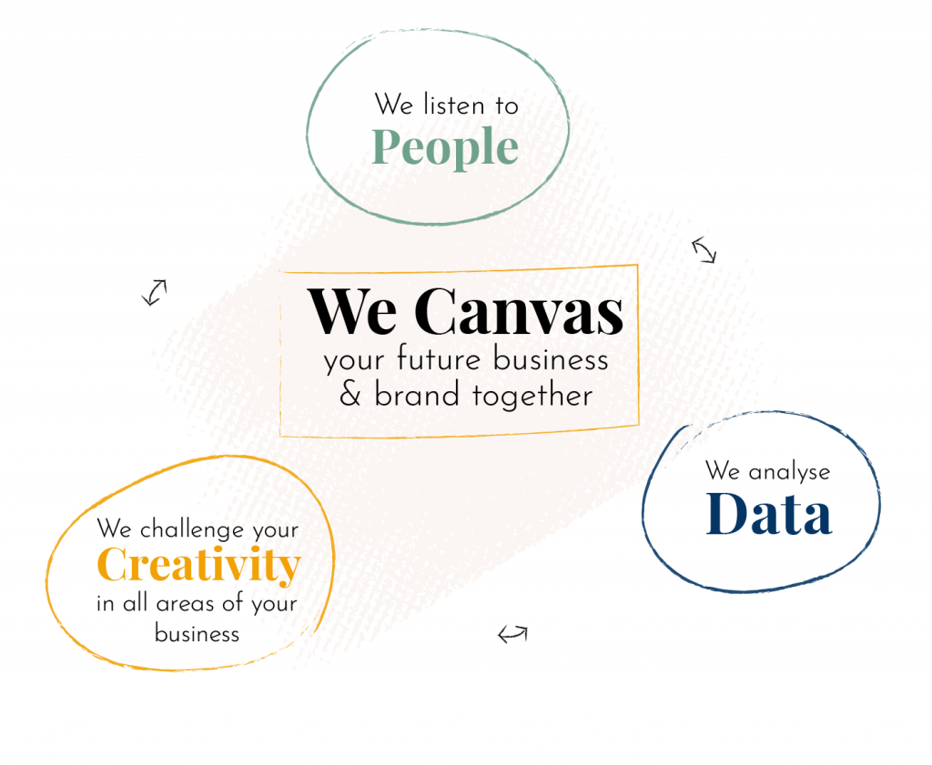
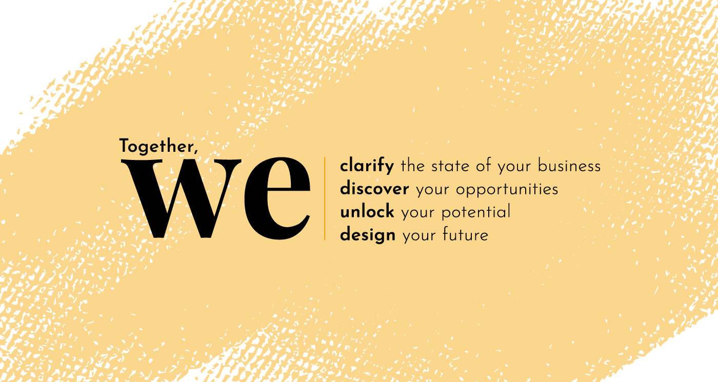
WeCanvas is a Business Model Consultancy based on the pillars of People, Data and Creativity.
They differentiate themselves from traditional business consultancy services by offering an inclusive and creative process as well as deliverables and tools which can be used after the project.
Brand Strategy
The definition of the brand fundamentals was key. We held different collaborative workshops with the 3 founders in order to identify the purpose, value proposition, values and personality of the WeCanvas brand.
We were then set to work on the first element of the Branding: The naming and tagline.
WeCanvas has a double meaning: On one hand, it refers to a collaborative, creative and visual methodology. On another hand, it refers to the Canvas as a deliverable which can be used by the client after the project in an autonomous and dynamic way.
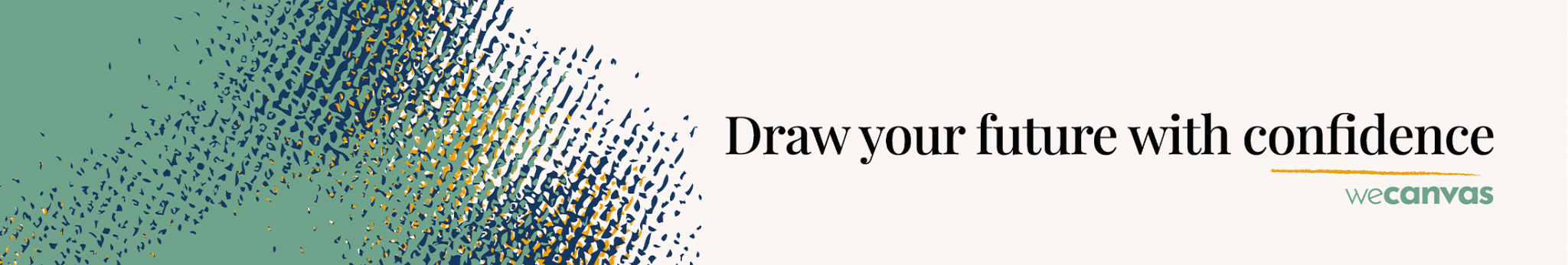
The Tagline: Draw your future with confidence refers once again to the process but also to the benefit of working with WeCanvas.
Visual Identity
Design Pillars
I wanted WeCanvas visuals to stand out from traditional business consulting companies by giving it a fresh, simple yet dynamic, fun and caring touch. It needed to showcase the 3 pillars of People, Data and Creativity which WeCanvas bases its methodology on. I identified 3 main design pillars:
Lots of white space combined with a strong colour palette
Giving lots of breathing space allows to build a fresh and serene feeling to the design. It applies to website design but also to all editorial or digital marketing materials. Furthermore the vibrant colours disrupt the white background to bring a dynamic and fun touch. Large bold and deep black headings allow the viewer to scan the main information easily.
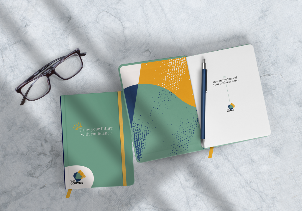
Textures and hand drawn elements
Textures bring warmth while hand drawn elements bring humanity and creativity. The usage of these type of elements illustrates how WeCanvas wants to break away from the traditional business consultancy mould and position themselves as being an inclusive, personal and creative service.
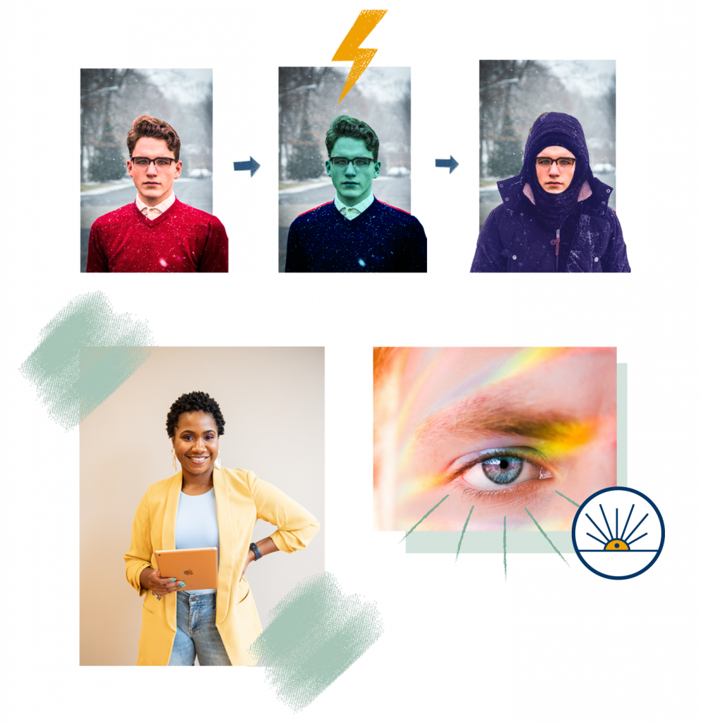
Authentic portraits
Business is about creating value for people, and through people. High quality photography featuring people was essential to the WeCanvas visual identity. Photography is mainly used within visual compositions combining them with textures and hand-drawn graphic elements. These dynamic compositions allow to break monotonous lay outs and make dense content more enjoyable to read.
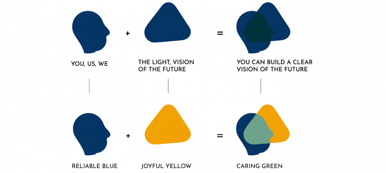
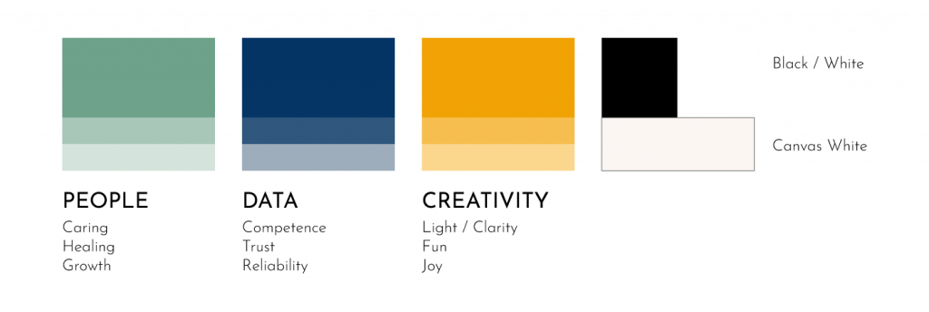
Brand Colours
The 3 main pillars of People, Data and Creativity being a key differentiator of the company, I wanted the colours to have a strong presence and meaning. Basing myself on Colour psychology, each colour can be linked to one of the pillars as well as the Brand’s values. This way, the colours can also be used as a code in marketing material or social media posts.
Typography
Playfair Display Bold: An elegant Serif font for Headings with a high contrast and delicate hairline.
Josefin Sans Light: A modern, light and classy Sans Serif font for body copies.
Iconography
A series of icons was created as part of the visual identity. I wanted the icons to be simple and light and I used thin lines and only 2 colours. Their white background allows to use them on clear and dark backgrounds.
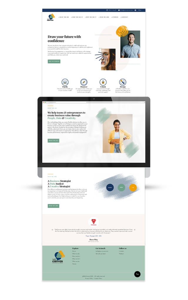
The Design of the web page was the major implementation of the Visual identity. The whole website has 8 pages.
The process:
I started by working on low fidelity wireframes in Figma basing myself on the structure of the WordPress template I had chosen. I always make sure to ask the client how the website will be implemented before starting with its design as it can mean I need to take into consideration certain limitations.
The second steps consisted in preparing high fidelity designs in Figma. I started by designing the different visual compositions, extra icons and backgrounds. I defined a few different components which would be repeated across the 8 pages. Once all the elements were ready, I could work on composing the different pages and making sure of a consistent visual vertical rhythm in each one of the pages.
For this project, I implemented the design myself to a WordPress template and delivered the website ready to go.
Deliverables
Visual identity:
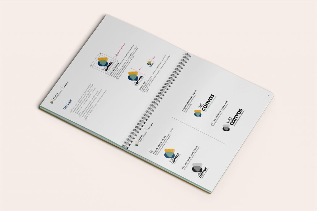
-Logo lock-ups: Rendition of main logo and its variations in all relevant formats -Vectorial design elements: Rendition of patterns and hand drawn elements.
-Iconography: Rendition and raw files of a series of icons -Website Home page Figma file -Email Signature -Social media and blog -Brand Guide Style including the Brand fundamentals, design and photography guidelines
Website:
-Figma high fidelity prototypes files
-Images files including visual compositions, extra icons and backgrounds
We use cookies on our website to help us make the website function properly, make it more secure, provide better user experience, and understand how the website performs. By clicking “Accept All”, you consent to the use of ALL the cookies. However, you may visit "Cookie Settings" to provide a controlled consent.
This website uses cookies to improve your experience while you navigate through the website. Out of these, the cookies that are categorized as necessary are stored on your browser as they are essential for the working of basic functionalities of the website. We also use third-party cookies that help us analyze and understand how you use this website. These cookies will be stored in your browser only with your consent. You also have the option to opt-out of these cookies. But opting out of some of these cookies may affect your browsing experience.
Necessary cookies are absolutely essential for the website to function properly. These cookies ensure basic functionalities and security features of the website, anonymously.
Cookie
Duration
Description
cookielawinfo-checkbox-analytics
11 months
This cookie is set by GDPR Cookie Consent plugin. The cookie is used to store the user consent for the cookies in the category "Analytics".
cookielawinfo-checkbox-functional
11 months
The cookie is set by GDPR cookie consent to record the user consent for the cookies in the category "Functional".
cookielawinfo-checkbox-necessary
11 months
This cookie is set by GDPR Cookie Consent plugin. The cookies is used to store the user consent for the cookies in the category "Necessary".
cookielawinfo-checkbox-others
11 months
This cookie is set by GDPR Cookie Consent plugin. The cookie is used to store the user consent for the cookies in the category "Other.
cookielawinfo-checkbox-performance
11 months
This cookie is set by GDPR Cookie Consent plugin. The cookie is used to store the user consent for the cookies in the category "Performance".
viewed_cookie_policy
11 months
The cookie is set by the GDPR Cookie Consent plugin and is used to store whether or not user has consented to the use of cookies. It does not store any personal data.
Functional cookies help to perform certain functionalities like sharing the content of the website on social media platforms, collect feedbacks, and other third-party features.
Performance cookies are used to understand and analyze the key performance indexes of the website which helps in delivering a better user experience for the visitors.
Analytical cookies are used to understand how visitors interact with the website. These cookies help provide information on metrics the number of visitors, bounce rate, traffic source, etc.
Advertisement cookies are used to provide visitors with relevant ads and marketing campaigns. These cookies track visitors across websites and collect information to provide customized ads.