
Brand Strategy – Logo & Visual System Design – Marketing collaterals – UI & Web Design
2022
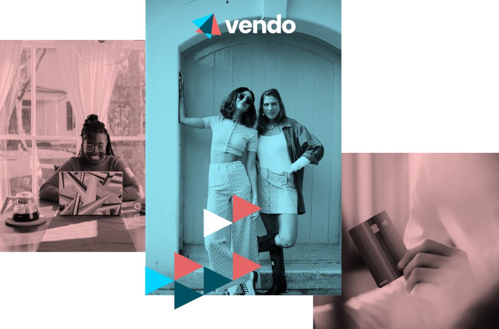
Vendo is a Payment processing platform for E-Commerce, content platforms and high-risk industries.
Their expertise in the industry and in the latest technologies contributes to their success but what really differentiate them from other payment processing companies is their human touch.
Their customer service and their community are the most valued aspects of their Brand. Vendo is the perfect combination of technology and humanity.
Vendo had already been reflecting and working on their brand identity, mission and visions and felt that their brand didn’t reflect their values.
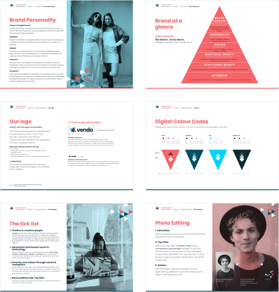
We started the project by defining their brand fundamentals. Together we focused on defining their brand personality and archetypes.
After having worked on a visual benchmark and a visual inspiration board, we established a detailed design roadmap as a guide for the design phase
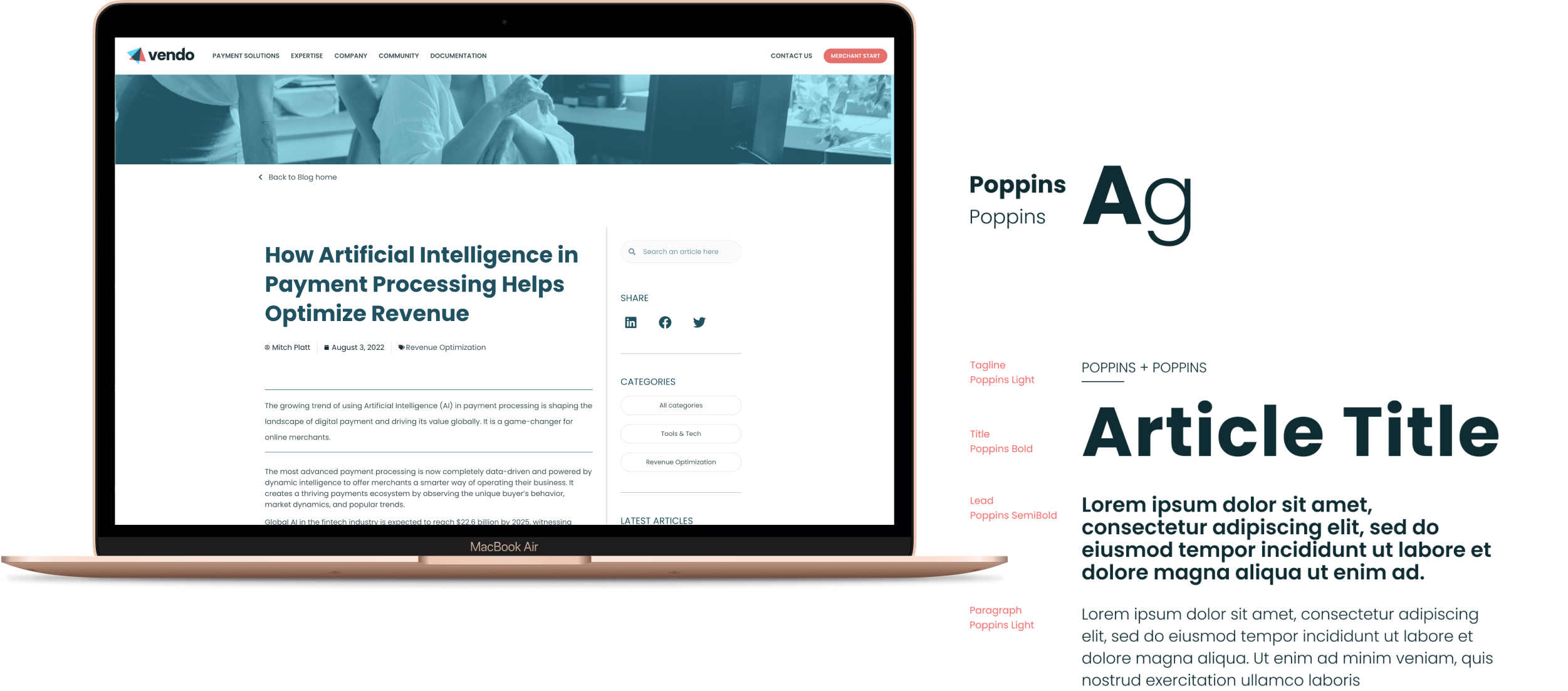
A balanced proposal that combines straight lines and a round and friendly font. Colours are carefully selected to create a dynamic and comforting palette that is implemented throughout the visual system.
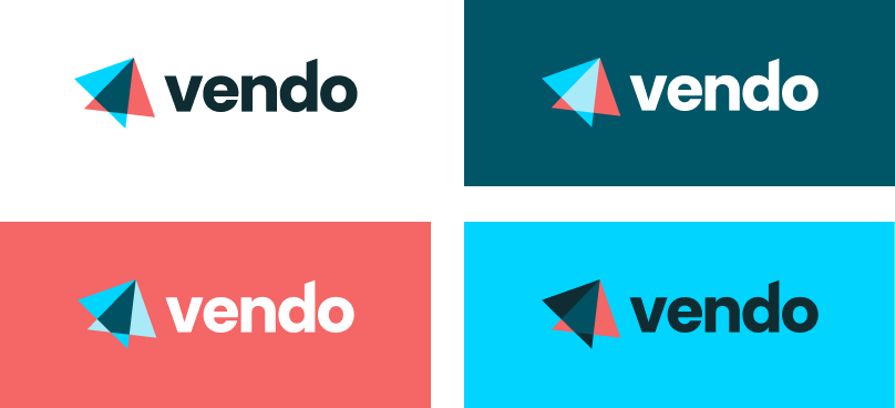
One of Vendo’s objective was to gain brand awareness. It was therefore important for me to create a very recognizable symbol which could be part of a full logo but also stand alone and become a key element of the Brand.
The inclination of the symbol and its bright colours make it dynamic and vibrant. It can be interpreted as a plane flying up, metaphor for growth.



The choice of colours was guided by the visual benchmark and the archetype identification done before the Design phase. We realised that most of fintech companies use light blues and greys which transmits a cold and distant personality. None of them really stand out and. There was a gap in warmer colour spectre as well as in more vibrant colours. It was a clear opportunity to make the brand pop.
Overlaying the vibrant blue and the warm, modern and fun Coral, brought me to the deep turquoise which brings balance to the proposal and allows me to add a more neutral colour to the palette.

Coral
Human
Warm
Creative

Turquoise
Comforting
Balance

Blue
Technology
Innovation
Caring

Black

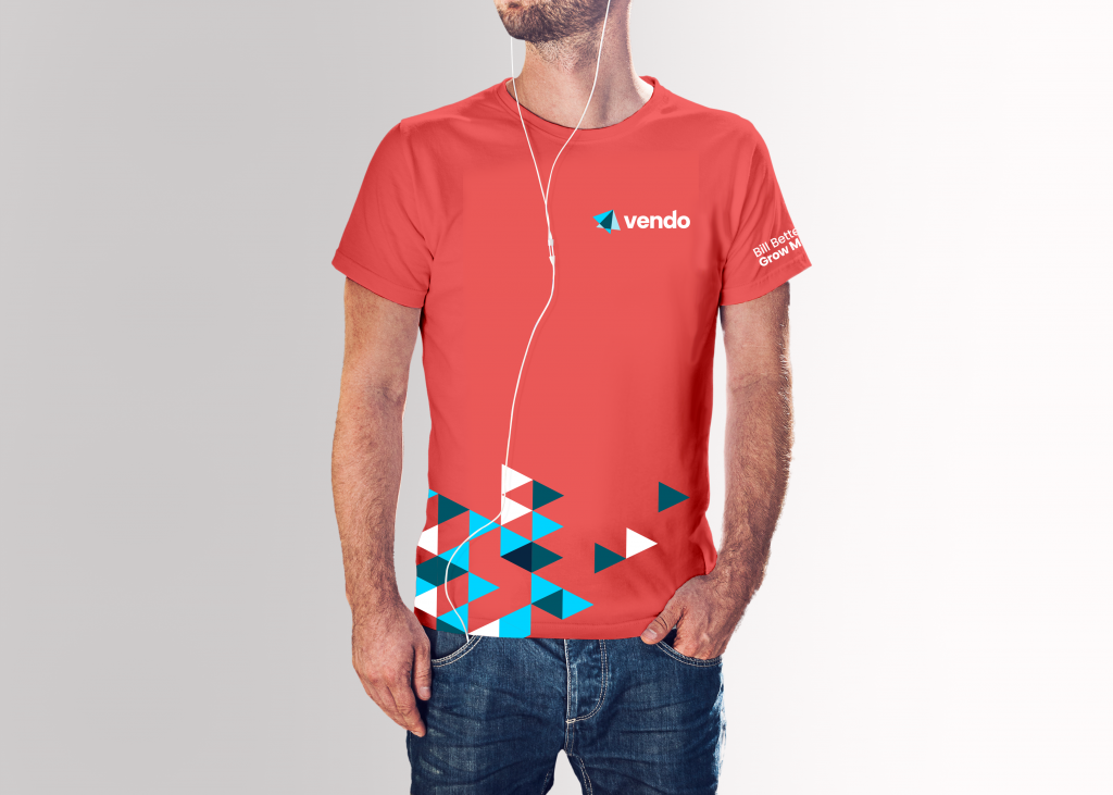
A dynamic yet simple triangle pattern
This pattern gives a sensation of movement and an optimist look and feel.
It is used mainly as a background for branded banners. It is also used to overlay photography.
It works well on merchandising and social media and can even be animated as done on Vendo’s Website.
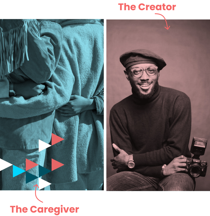
I wanted the photography to stand apart from other payments platforms – it showcases Vendo’s uniqueness and energy. It was important for the imagery to evoke emotion, to excite, inspire and get people feel they are cared for and part of a strong community. This meant capturing real facial expression and strong personalities.
Most of the imagery will be headshots or people interacting with technology in a relaxed and secure environment.
All photography is used in Black and White and overlayed with a blue or coral filter. This makes the general visual identity unique. It is also a way of personalizing stock imagery which is might be used by other companies.

Brand Elements:
-Logo lock-ups: Horizontal, Vertical and Avatar versions in all colour variations
– Typography
– Photography art direction
– Brand colour palette
-Patterns
-Iconography (Set of 50 icons in colour and Black and White)
Marketing Materials:
– Website Home page Figma file
– Email Signature
– Invoice Template
– Event Banners
– Social Media banners and avatars
Brand Guide Style
including the Brand fundamentals, design and photography guidelines
Cat was a gift to work with. Well organized, creative, and driven. She exceeded all expectations and will definitely recommend and work with Cat again.
Mitch P. - Vendo Services - CEO
Cat was a gift to work with. Well organized, creative, and driven. She exceeded all expectations and will definitely recommend and work with Cat again.
Mitch P. - Vendo Services - CEO
| Cookie | Duration | Description |
|---|---|---|
| cookielawinfo-checkbox-analytics | 11 months | This cookie is set by GDPR Cookie Consent plugin. The cookie is used to store the user consent for the cookies in the category "Analytics". |
| cookielawinfo-checkbox-functional | 11 months | The cookie is set by GDPR cookie consent to record the user consent for the cookies in the category "Functional". |
| cookielawinfo-checkbox-necessary | 11 months | This cookie is set by GDPR Cookie Consent plugin. The cookies is used to store the user consent for the cookies in the category "Necessary". |
| cookielawinfo-checkbox-others | 11 months | This cookie is set by GDPR Cookie Consent plugin. The cookie is used to store the user consent for the cookies in the category "Other. |
| cookielawinfo-checkbox-performance | 11 months | This cookie is set by GDPR Cookie Consent plugin. The cookie is used to store the user consent for the cookies in the category "Performance". |
| viewed_cookie_policy | 11 months | The cookie is set by the GDPR Cookie Consent plugin and is used to store whether or not user has consented to the use of cookies. It does not store any personal data. |
