Brand Discovery – Logo & Visual System Design + Editorial Design
La Rosadita
2020
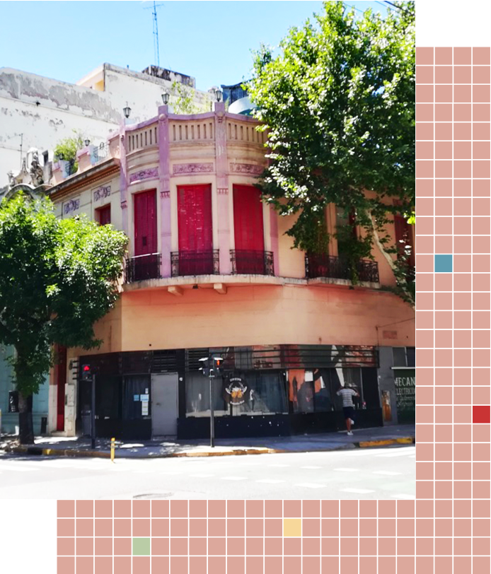
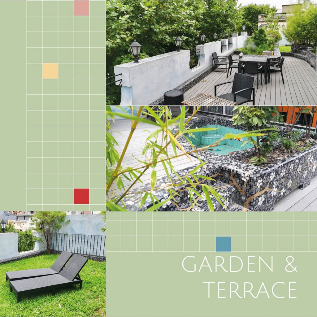
La Rosadita is a historic luxury house to rent in Buenos Aires, Argentina. It is a 100+ year old Property in historic centre of San Cristobal, walking distance to San Telmo Market and Puerto Madero. It is over 300 m2 and has been refurbished in a transitional style with bohemian, classical and pop influences. Traditional materials and designs such as iron, glass and ceramics marry modern accessories and vibrant colour touches.
Visual Identity
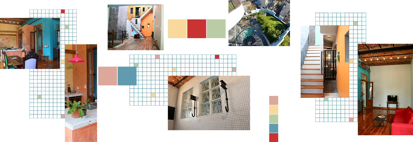
The business concept behind La Rosadita is to provide a luxury home away from home type accommodation to mid- or long-term visitors. I wanted the visual identity to transmit the bohemian, yet historic essence of the building while transmitting a comforting and exclusive feel. Architectural materials and the interior design of the house were my main inspirations.
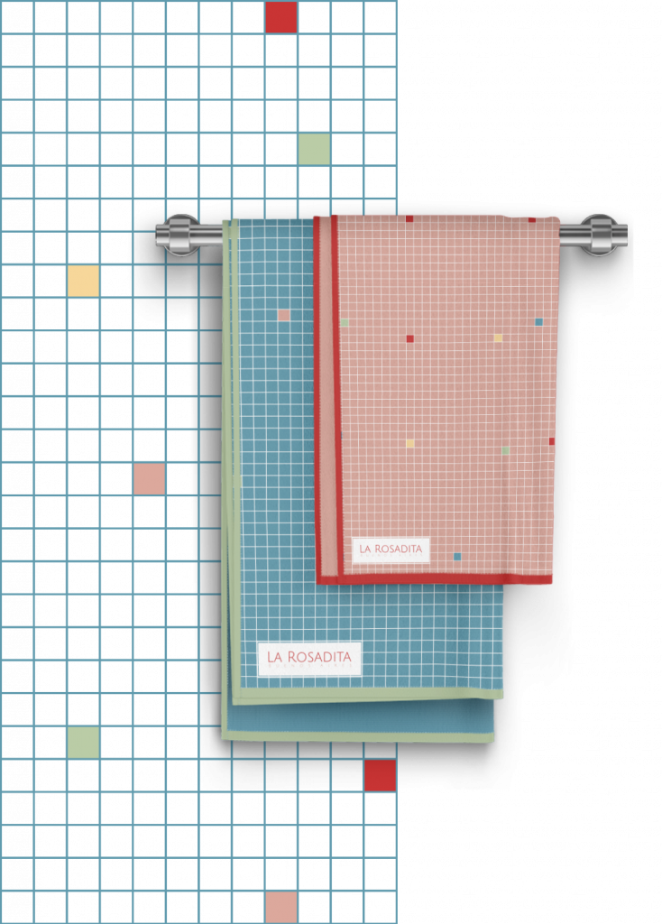
Mosaics of small tiles are used across the house: bathrooms, gardens, kitchen top, etc. The repetition of these small tiles as well as different colour combinations creates rich textures as well as an intimate feel.
On another hand, the use of wrought iron for garden fences or on glass doors create organic refined shapes which transmit a sense of subtle movement and contrast.
Furthermore, the interior design combines vibrant touches of colour with pastel and earthy colours larger surfaces.
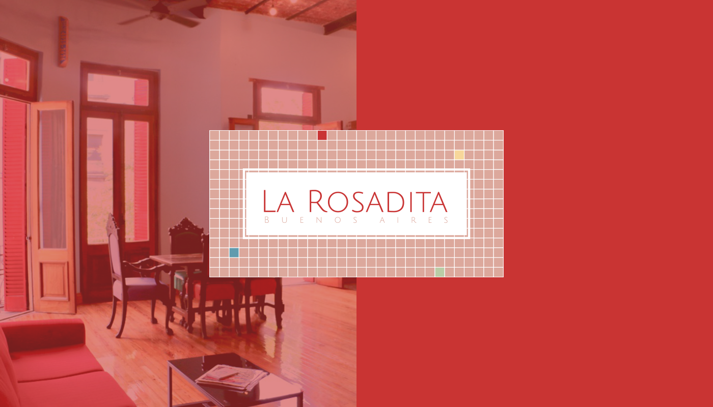
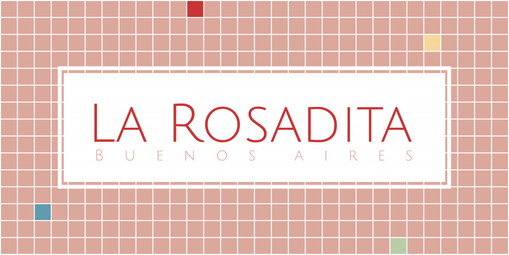
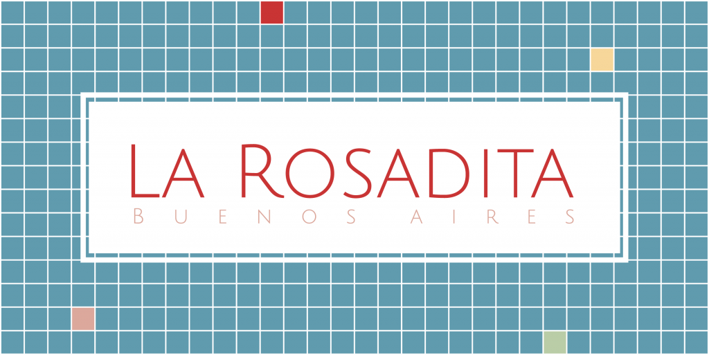
The Logo
The logo needed to feel welcoming, homely as well as refined and elegant. It is composed of a tile mosaic inspired background and a delicate typography. The logo is available in the 2 main brand colours.
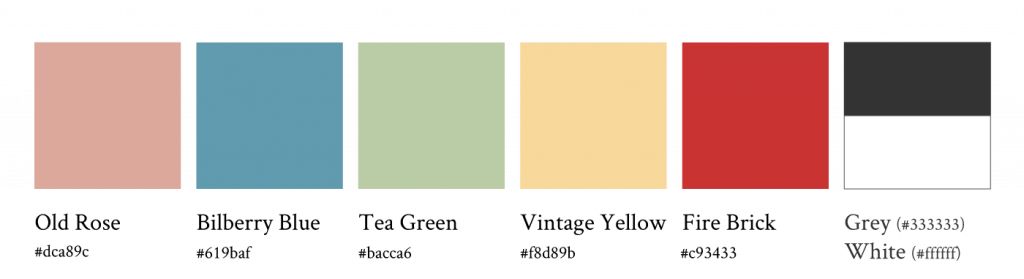
Colour Palette
The colour palette was designed mainly from the pastel and earthy colours used in the interior decoration of La Rosadita. They transmit a comforting yet elegant feel to the house which I wanted to reflect in the visual identity.
The Old Rose and Bilburry blue are the main colours while the other colours come and give a sparkle to the backgrounds and secondary elements.
Typography
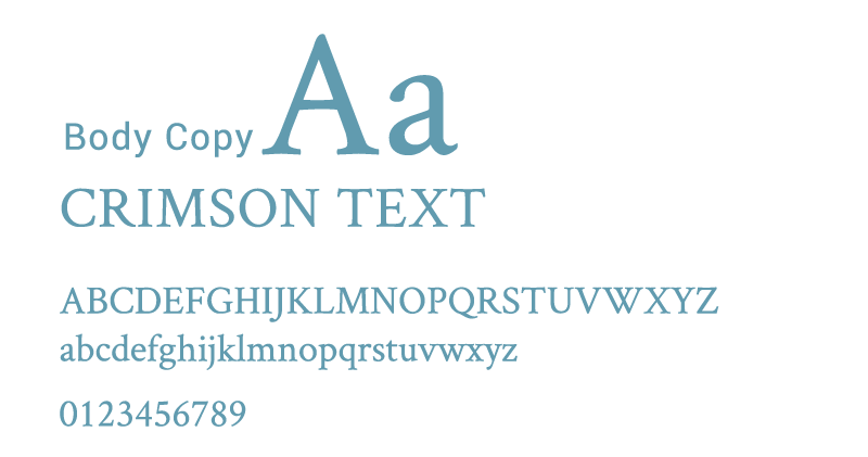
Julius Sans One: A Sans Serif font used in the Logo but also for Headings. Its thin strokes and lightweight gives this font a smooth and delicate look to it.
Crimson text: This is a type which was originally designed for book production. It has a traditional and old style to it and is easy to read.
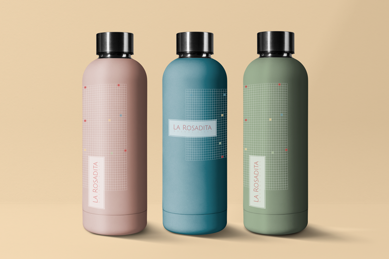
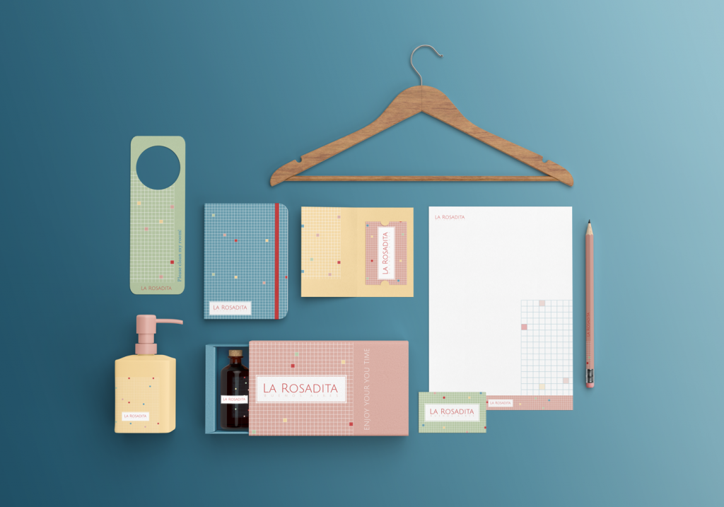
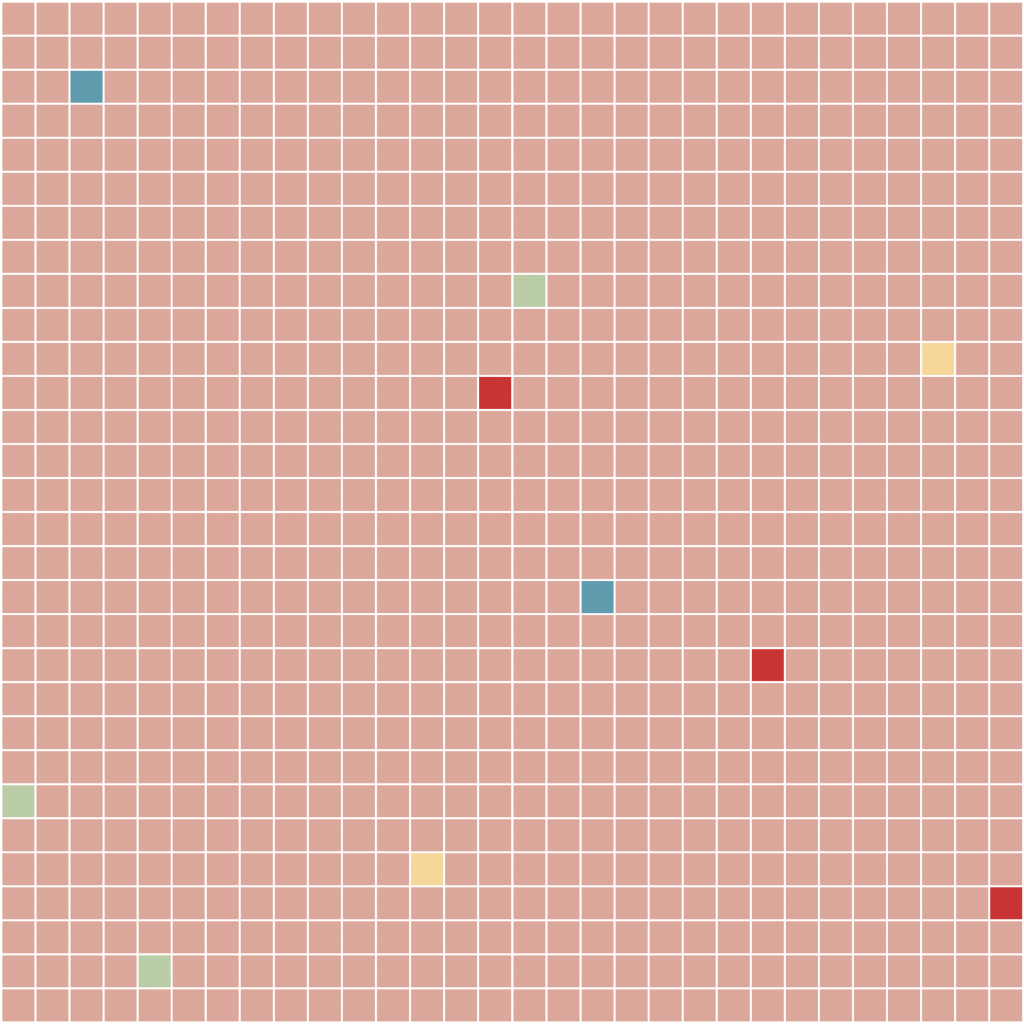
Textures and backgrounds
The tile mosaic patterns are repeated all along the visual identity. It is not only applied to the logo but also as backgrounds and textures for marketing materials and merchandising.
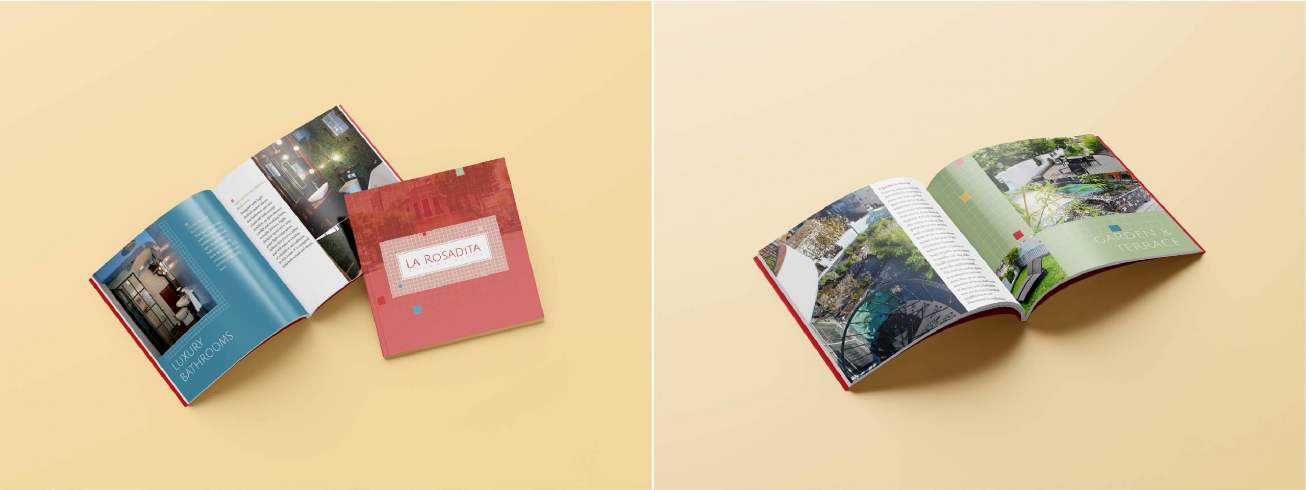
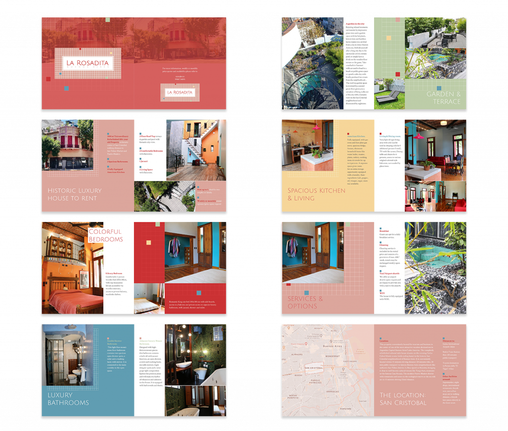
Brochure
Editorial Design
The brochure is a composed of 12 pages + double sided cover. It was designed implementing the new Visual identity. Tile shape mosaic backgrounds and textures are repeated throughout the brochure and gives it a dynamic reading experience. Each spread showcases a feature of the house where photography and written content complement each other.
Deliverables
Basic Visual identity:
-Logo lock-ups: Rendition of main logo and its variations in all relevant formats -Vectorial design elements: Rendition of backgrounds and texture elements -Business Cards Rendition -Stationary: Rendition of all stationary design -Water Bottle and merchandizing: Rendition of water bottle and other merchandizing design -Basic Brand Guide Style including the design guidelines
We use cookies on our website to help us make the website function properly, make it more secure, provide better user experience, and understand how the website performs. By clicking “Accept All”, you consent to the use of ALL the cookies. However, you may visit "Cookie Settings" to provide a controlled consent.
This website uses cookies to improve your experience while you navigate through the website. Out of these, the cookies that are categorized as necessary are stored on your browser as they are essential for the working of basic functionalities of the website. We also use third-party cookies that help us analyze and understand how you use this website. These cookies will be stored in your browser only with your consent. You also have the option to opt-out of these cookies. But opting out of some of these cookies may affect your browsing experience.
Necessary cookies are absolutely essential for the website to function properly. These cookies ensure basic functionalities and security features of the website, anonymously.
Cookie
Duration
Description
cookielawinfo-checkbox-analytics
11 months
This cookie is set by GDPR Cookie Consent plugin. The cookie is used to store the user consent for the cookies in the category "Analytics".
cookielawinfo-checkbox-functional
11 months
The cookie is set by GDPR cookie consent to record the user consent for the cookies in the category "Functional".
cookielawinfo-checkbox-necessary
11 months
This cookie is set by GDPR Cookie Consent plugin. The cookies is used to store the user consent for the cookies in the category "Necessary".
cookielawinfo-checkbox-others
11 months
This cookie is set by GDPR Cookie Consent plugin. The cookie is used to store the user consent for the cookies in the category "Other.
cookielawinfo-checkbox-performance
11 months
This cookie is set by GDPR Cookie Consent plugin. The cookie is used to store the user consent for the cookies in the category "Performance".
viewed_cookie_policy
11 months
The cookie is set by the GDPR Cookie Consent plugin and is used to store whether or not user has consented to the use of cookies. It does not store any personal data.
Functional cookies help to perform certain functionalities like sharing the content of the website on social media platforms, collect feedbacks, and other third-party features.
Performance cookies are used to understand and analyze the key performance indexes of the website which helps in delivering a better user experience for the visitors.
Analytical cookies are used to understand how visitors interact with the website. These cookies help provide information on metrics the number of visitors, bounce rate, traffic source, etc.
Advertisement cookies are used to provide visitors with relevant ads and marketing campaigns. These cookies track visitors across websites and collect information to provide customized ads.