Brand Strategy – Logo & Visual System Design – Marketing collaterals + Poster Design
2016
Canal Citoyen is a project by Particitiz Asbl. Particitiz invited citizens who work or live around Brussel’s Channel area to be an active actor during a debate and day event to create a dialogue between citizens from different backgrounds and politicians.
The visual assets needed to illustrate the urban environment, the dynamic and active participation of citizens and needed to be appealing to citizens from different backgrounds and cultures.
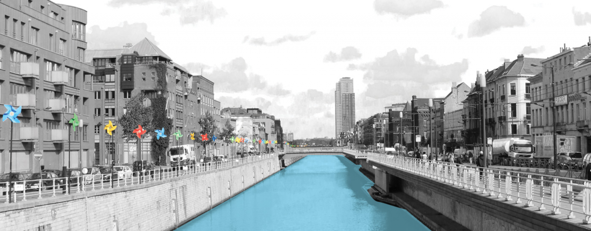
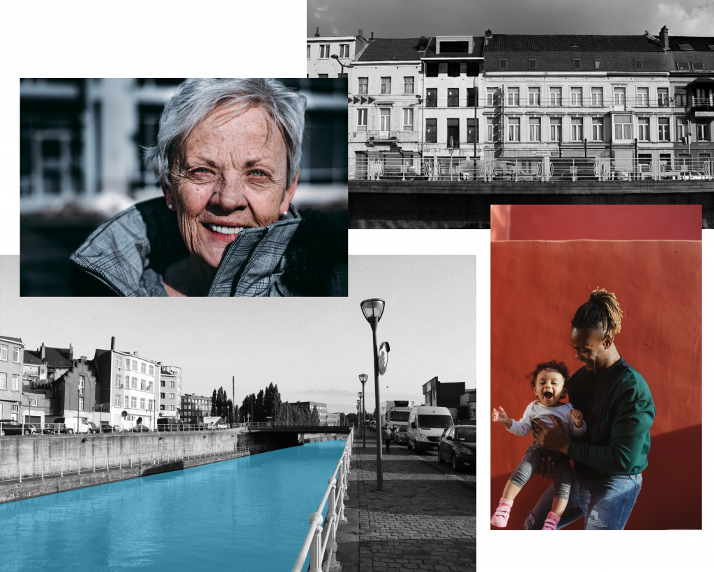
The canal is the emblematic spot of the neighbourhood. It is also a symbol of flow, movement and connection. The neighbourhood, at the heart of the Brussels and by the canal, was historically a strategical area for industry. Nowadays, it is a blend urban feel and multicultural warmth. These are the elements I based the Visual Identity on using black and white photography, geometrical shapes and bright colours.
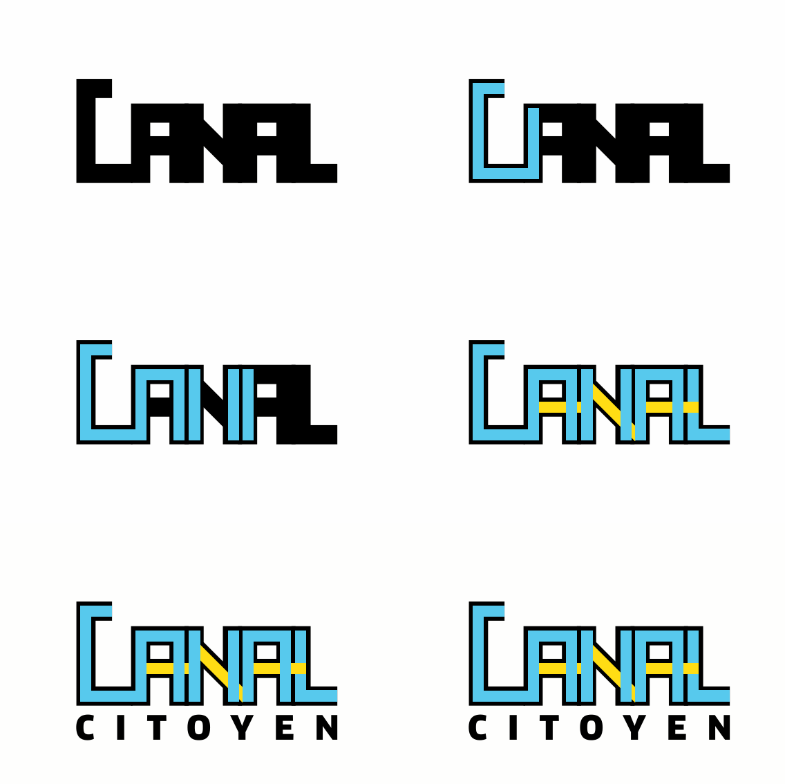
Because the event was a day event, the logo needed to be the central element of the visual identity. It needed to be recognisable and transmit the essence of the event. The objective was to have a logo which could attract the eye by its vibrant colours as well as by its solid look and feel. Furthermore, the metaphor of the water flowing within the canal bed is translated visually.

Roboto: Its shapes are largely geometric. At the same time, the font features friendly and open curves. By using all caps for title, we create a rigid rythm which transmits solidity and trust. It is also a typefont which is easy to read which makes it accesible and inclusive.


People connect to people. Using genuine photography with natural lighting transmits security, positivity and helps the user to identify him/her self with the service. Furthermore, we use pictures of the neighbourhood. These images are used in Back and white with a specific highlight to the canal.
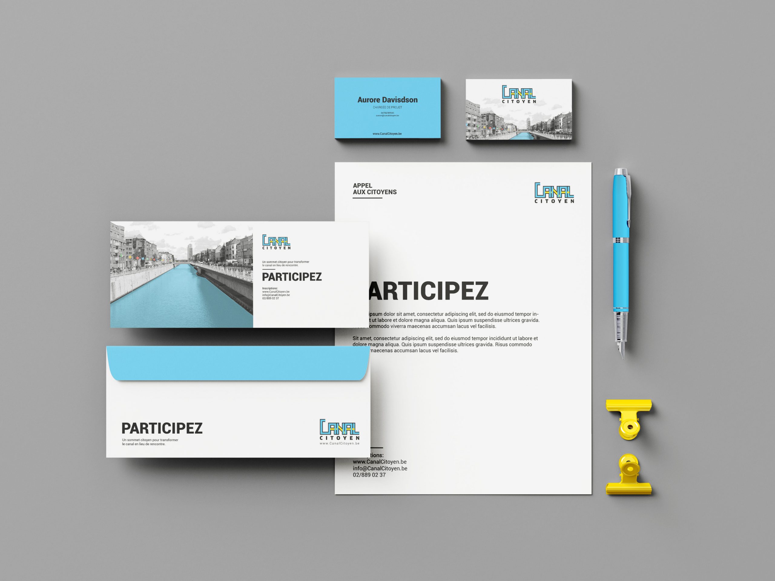
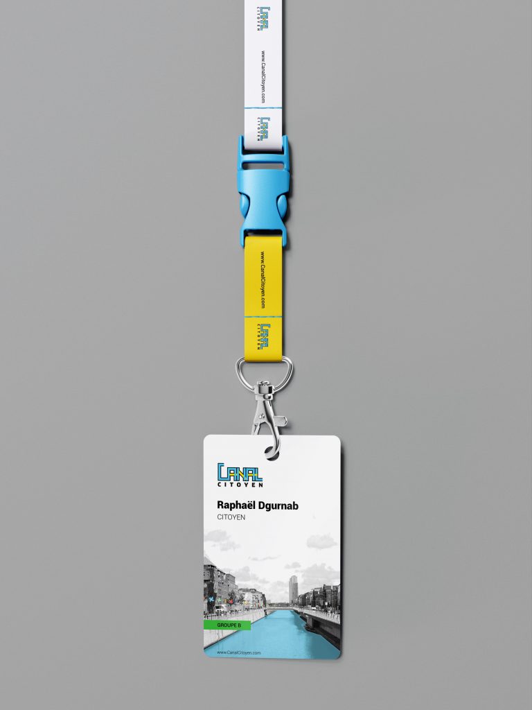
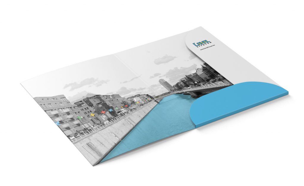
In order to welcome all participants, facilitators and politicians, it was essential to design a series of materials for the event. Name badges, the event folder being the main touch points, they had to match the design of the letter, flyer and poster participants had received previously.
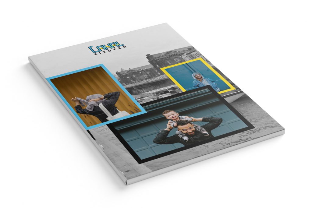
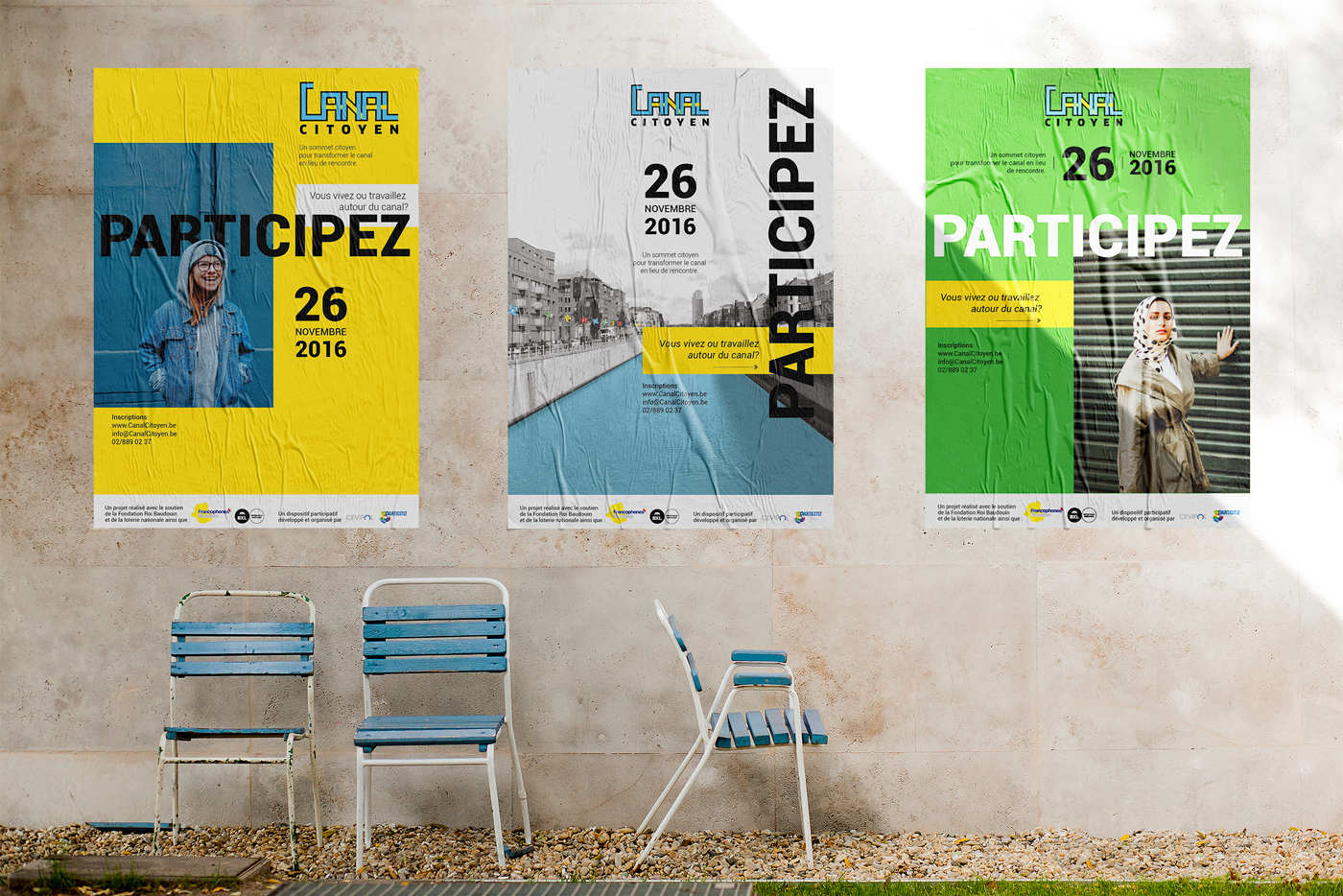
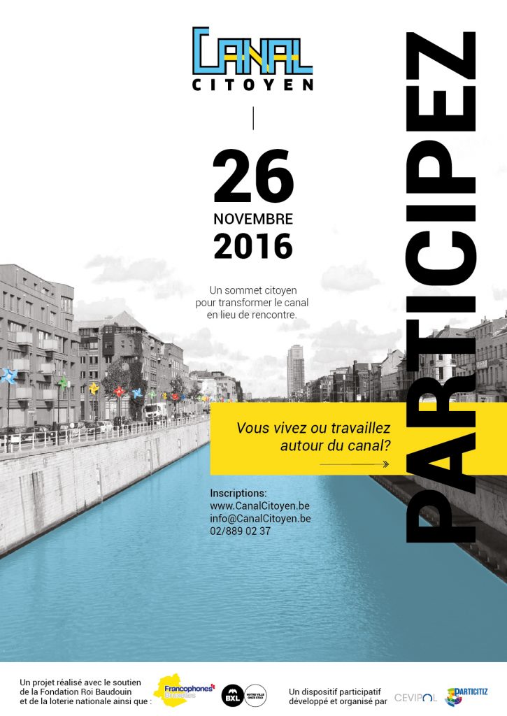
The poster was for most of participants the first visual impact they had concerning the event. It needed to be eye catching and welcoming. The use of the vibrant brand colours and the combination with genuine photography helped make citizens feel identified and welcomed.
Visual identity:
-Logo lock-ups: Rendition of main logo and its variations in Black and White
-Animated Logo: Rendition of animation in .gif format
-Stationary: Business cards, Letter head, Flyer template, Envelopes. Rendition in PDF for print.
-Brand Guide Style
Extra Marketing Material:
-Event material: Name badge, Folder
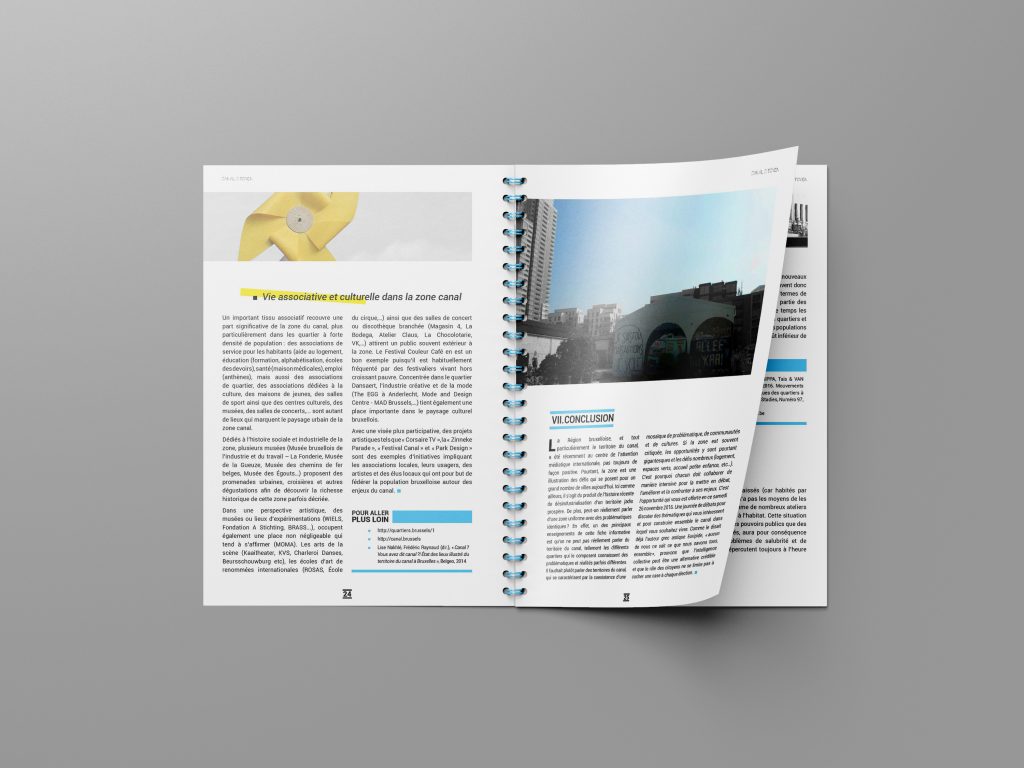
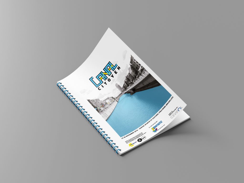
-Event report: Rendition in PDF
-Poster design: 3 designs to be combined.
| Cookie | Duration | Description |
|---|---|---|
| cookielawinfo-checkbox-analytics | 11 months | This cookie is set by GDPR Cookie Consent plugin. The cookie is used to store the user consent for the cookies in the category "Analytics". |
| cookielawinfo-checkbox-functional | 11 months | The cookie is set by GDPR cookie consent to record the user consent for the cookies in the category "Functional". |
| cookielawinfo-checkbox-necessary | 11 months | This cookie is set by GDPR Cookie Consent plugin. The cookies is used to store the user consent for the cookies in the category "Necessary". |
| cookielawinfo-checkbox-others | 11 months | This cookie is set by GDPR Cookie Consent plugin. The cookie is used to store the user consent for the cookies in the category "Other. |
| cookielawinfo-checkbox-performance | 11 months | This cookie is set by GDPR Cookie Consent plugin. The cookie is used to store the user consent for the cookies in the category "Performance". |
| viewed_cookie_policy | 11 months | The cookie is set by the GDPR Cookie Consent plugin and is used to store whether or not user has consented to the use of cookies. It does not store any personal data. |
