
Brand Strategy – Logo & Visual System Design – Marketing collaterals
2023
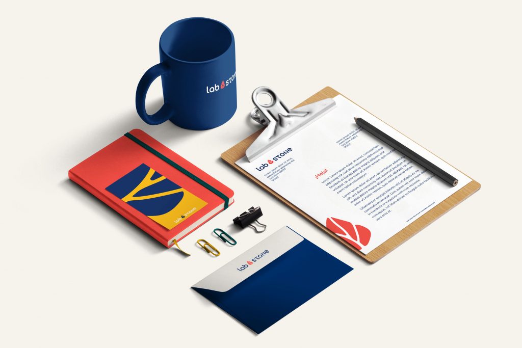
Labstone is a new B2B brand that produces and distributes holds and volumes. They want to transform the climbing industry by offering more sustainable and affordable high-quality holds and volumes. Their mission is to produce a product that is more durable in time, lighter and reusable.
Their manufacturing process is innovative and industrial which allows them to create a high-quality product at the same time as maintaining a very competitive price.

A complete and collaborative process.

-Series of collaborative workshops to define the brand’s fundamentals (Mission, Vision, Differentiator, Values, Personality),
-Visual & Naming Benchmark of competitors

Series of collaborative workshops followed by personal verification and creative brainstorming sessions.

I propose a design roadmap including between 4 and 6 visual pillars before starting the design phase, This allows us to align on the concepts and the ways I will be conveying these in a visual way.

I presented 2 visual proposals. From here, clients choose one of the options and have up to 3 correction rounds included in the price.

Once the design is approved, all assets and Brand guidelines are prepared and shared in organized folders.
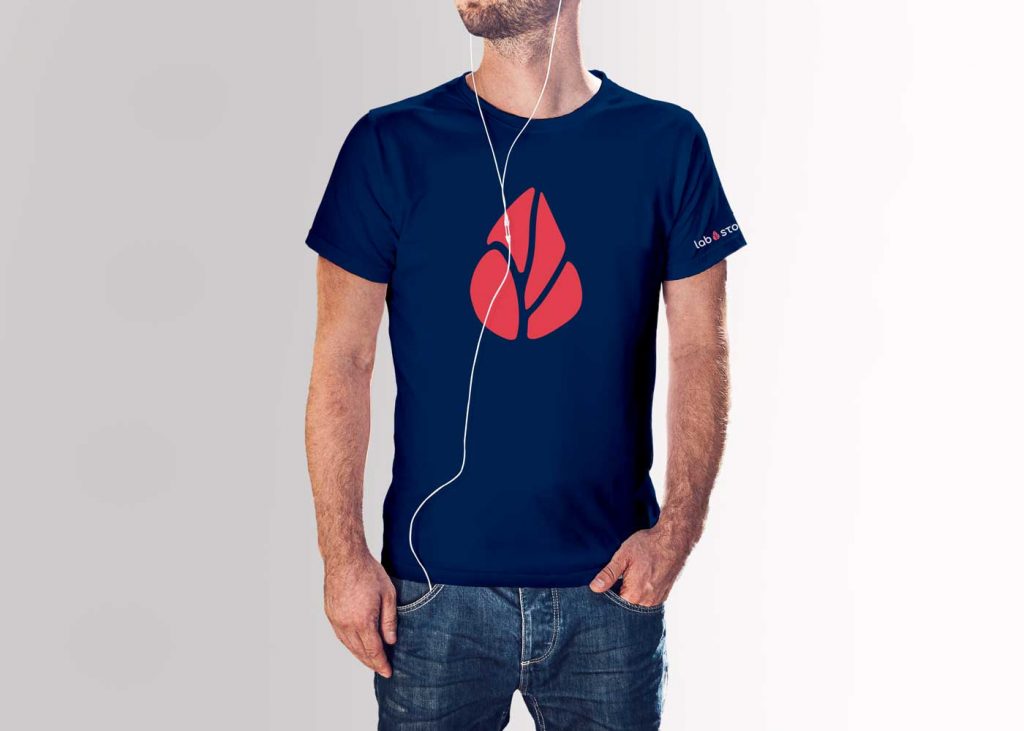
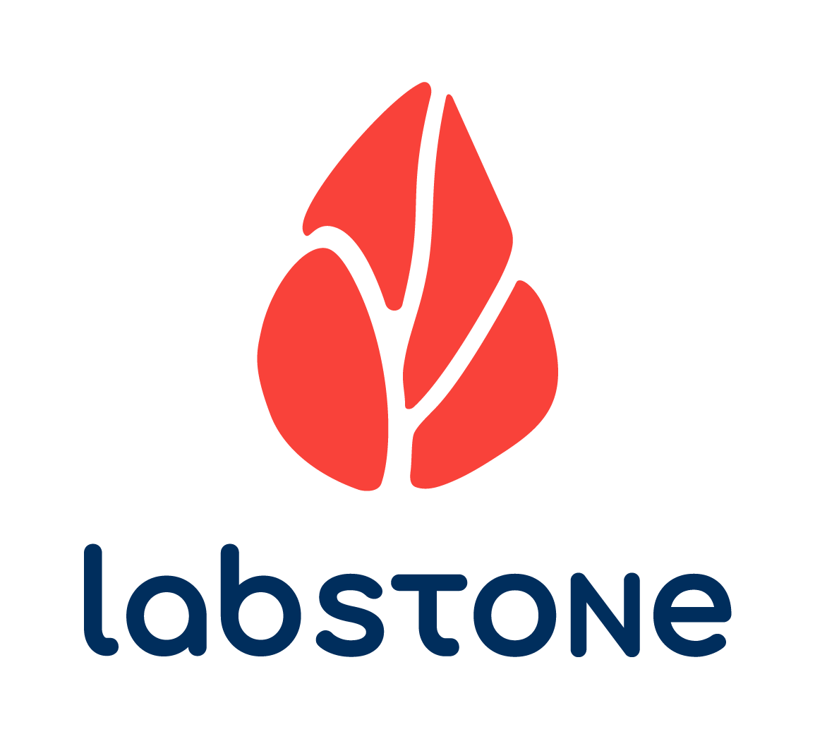
Inspired by the shapes of the holds and volumes, the leaf as a symbol of lightness, of
growth and sustainability, and the rounded shapes of the hooks, the logo is ment to transmit a friendly, light yet steady feeling. Its symbol can be seen as a leaf or even a fingerprint which represents the desire of Labstone to leave a positive mark in the climbing industry by bringing in sustainable solutions at competitive prices. The wordmark contributes to a steady and solid visual feeling by using balanced spacing between letters as well as choosing a type with clear shapes.



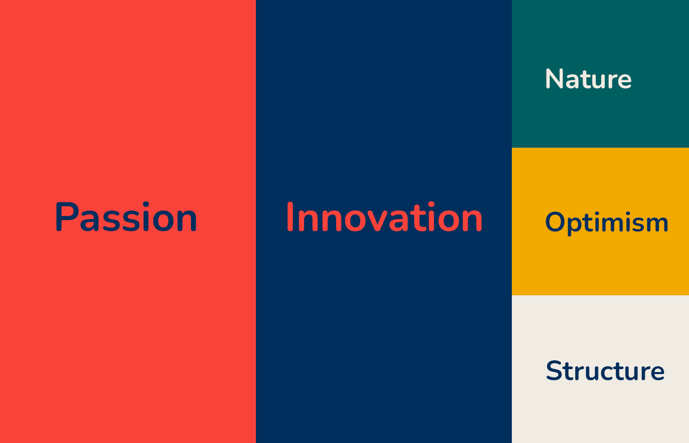
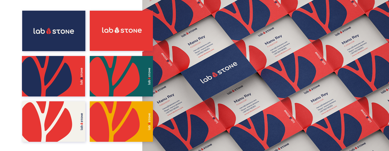
An organic palette made up of primary colors.
Red transmits passion and strength.
Navy blue represents innovation, wisdom and knowledge. Blue is a color that also transmits tranquility and serenity.
As secondary colors, we use green and yellow. these colors complete the palette with natural colors
and create a dynamic yet simple palette.
Creamy grey is the color of the indoor walls. It is softer than pure white but does not replace it. It will allow us to create contrasts and blocks of information.
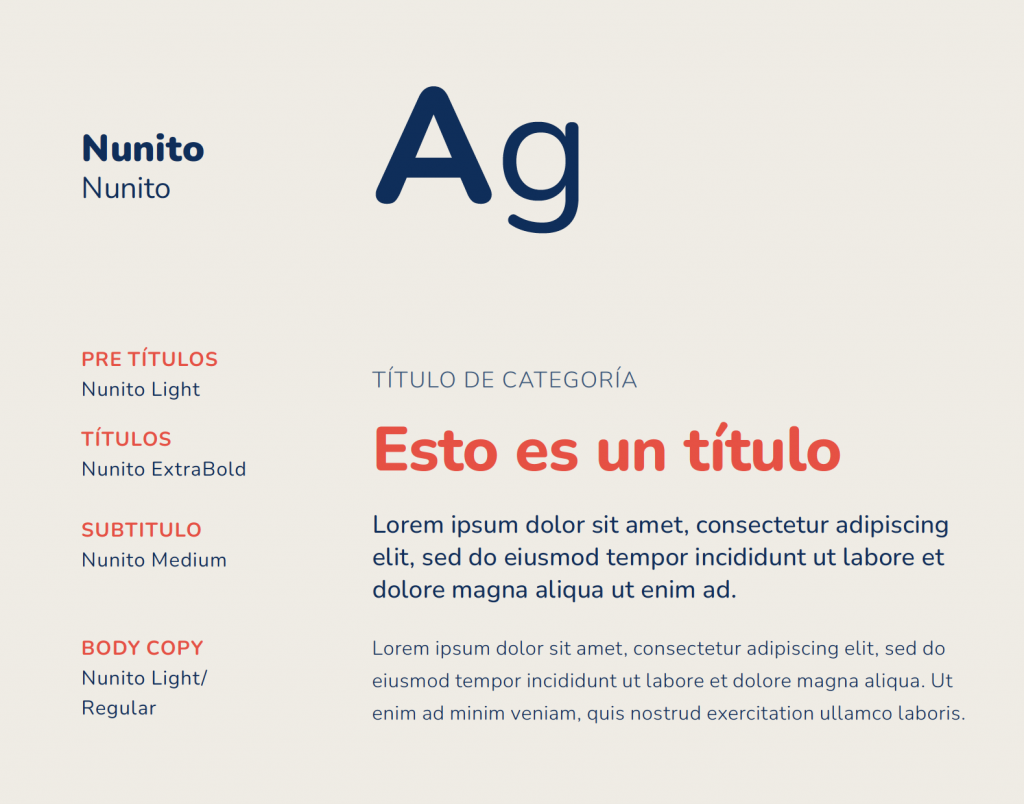
A single typeface: Round and innovative.
Nunito is a well-balanced and highly readable sans-serif typeface. The characters have thin, even strokes that work well both for headlines as well as for body copy. They give a feeling of lightness without losing solidity.
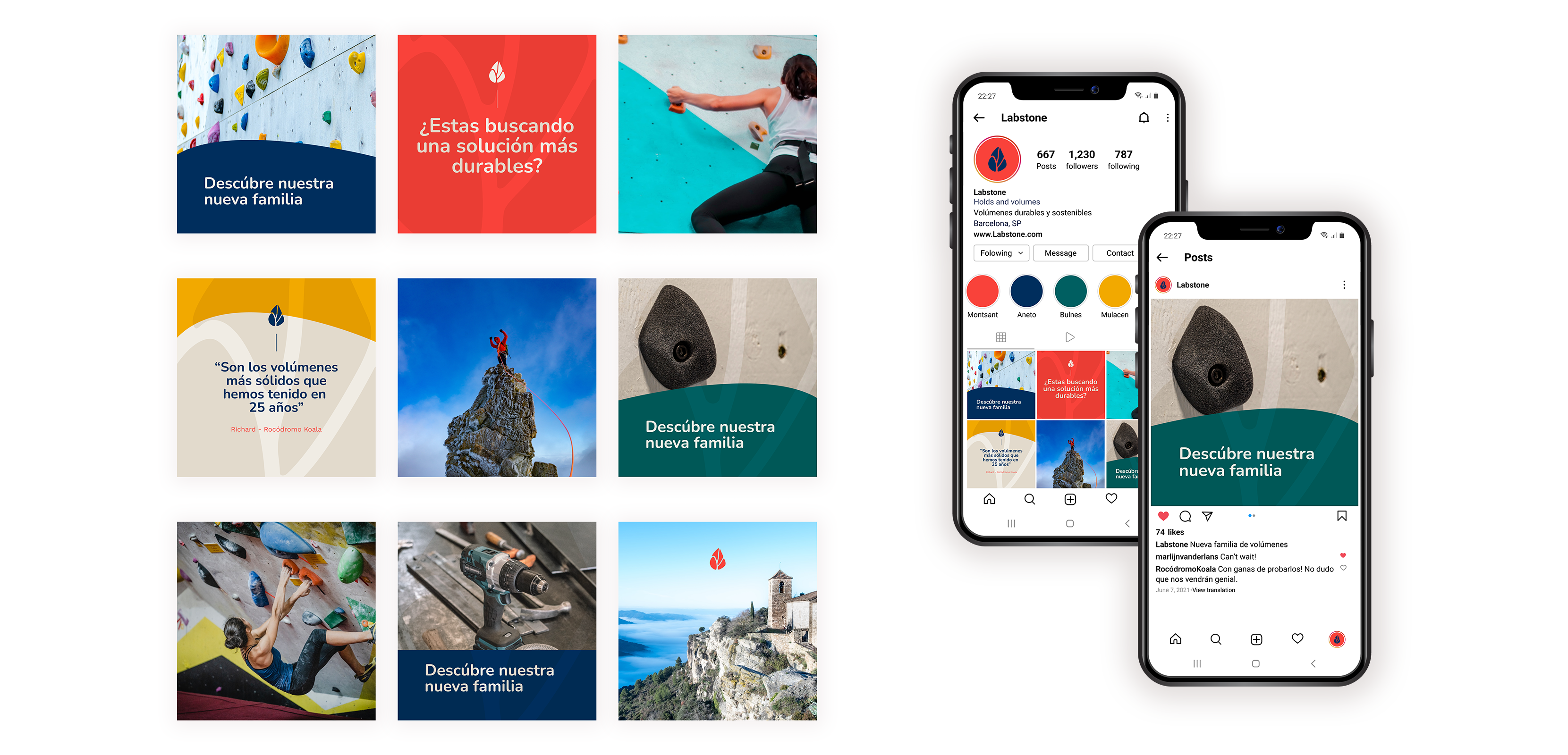
Brand Elements:
-Logo lock-ups: Horizontal, Vertical and Avatar versions in all colour variations
– Typography
– Photography art direction
– Brand colour palette
– Iconography
Marketing Materials:
– Stationary and Business Cards
– Social Media banners and avatars
– Social Media post templates in Canva
Brand Guide Style
Including the Brand fundamentals, design and photography guidelines.
| Cookie | Duration | Description |
|---|---|---|
| cookielawinfo-checkbox-analytics | 11 months | This cookie is set by GDPR Cookie Consent plugin. The cookie is used to store the user consent for the cookies in the category "Analytics". |
| cookielawinfo-checkbox-functional | 11 months | The cookie is set by GDPR cookie consent to record the user consent for the cookies in the category "Functional". |
| cookielawinfo-checkbox-necessary | 11 months | This cookie is set by GDPR Cookie Consent plugin. The cookies is used to store the user consent for the cookies in the category "Necessary". |
| cookielawinfo-checkbox-others | 11 months | This cookie is set by GDPR Cookie Consent plugin. The cookie is used to store the user consent for the cookies in the category "Other. |
| cookielawinfo-checkbox-performance | 11 months | This cookie is set by GDPR Cookie Consent plugin. The cookie is used to store the user consent for the cookies in the category "Performance". |
| viewed_cookie_policy | 11 months | The cookie is set by the GDPR Cookie Consent plugin and is used to store whether or not user has consented to the use of cookies. It does not store any personal data. |
